
↓
Grafton Yard
Context
Grafton Yard is an up-and-coming business owned by a charming couple called Freddie and Rebecca, who together create beautiful handcrafted candles. Their colourful products are packed with joy, and so is their social media feed – which has a devout and quickly growing following (who already love the brand).
My aim was to take the joy that runs through everything they do and imbue their logotype and brand assets with this same uplifting quality – all the while retaining brand recognition and desirability.
Client
Grafton Yard
Agency
Alec Tear


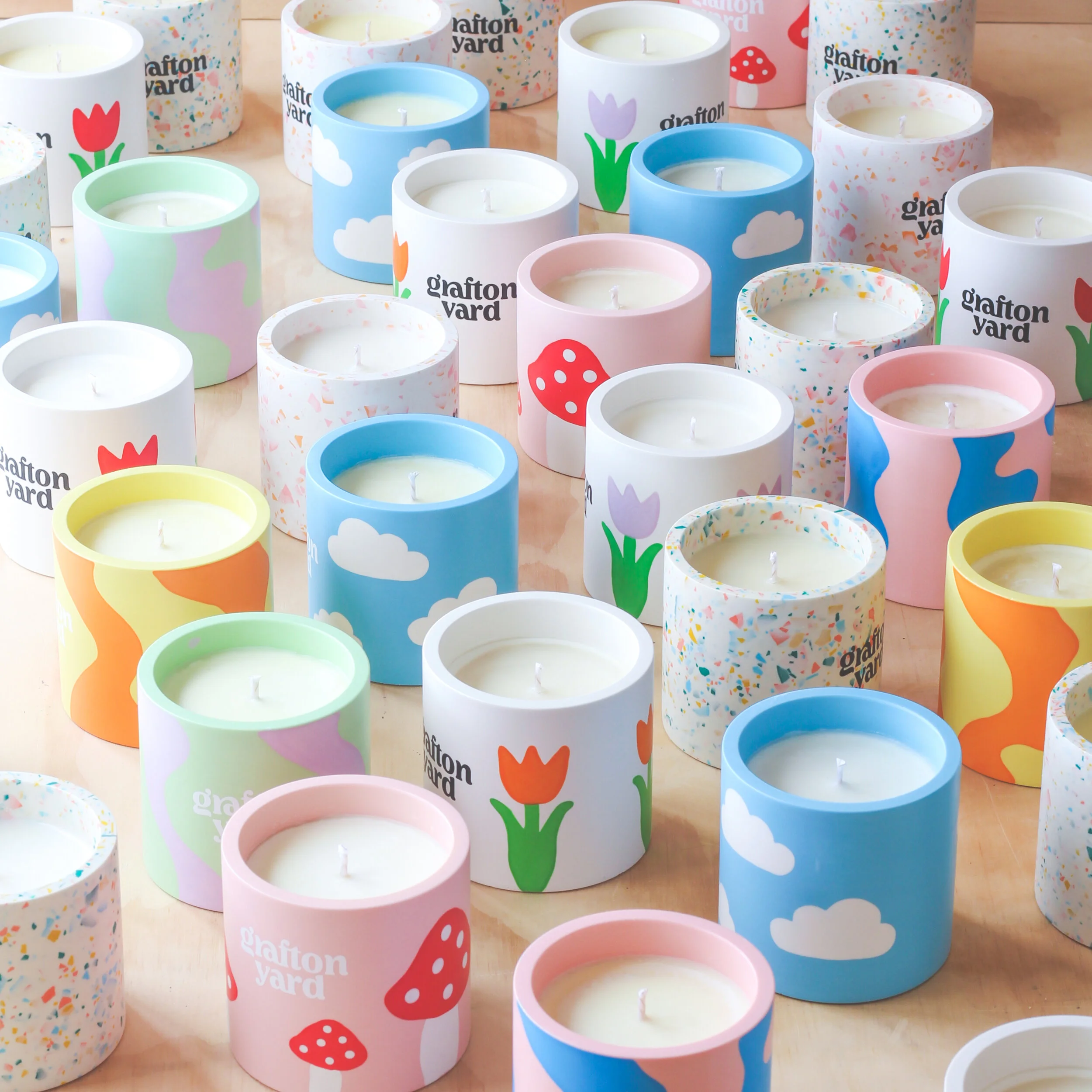


The contours of the lettering are inspired by the comforting shapes of a cloud – a symbol that Freddie & Rebecca use on some of their best selling products. We all felt that the cloud captured the right spirit for the brand, and added a touch of light-hearted humour since England is always so cloudy.


One important consideration when designing the logotype was that the ‘g’ needed to have enough personality to exist as a stand-alone monogram for the brand. Doing this gave us an asset to use as a sign-off, or to represent the brand in small spaces.


