
↓
Allsopp’s
Context
It isn’t often you get to redesign a near 300-year-old start-up, but Allsopp’s is just that. Founded in 1730, Allsopp’s grew to become one of the biggest breweries in the world over the next two centuries, and has one of the most incredible brand histories a designer is likely to ever come across – including cameos from the likes of Napoleon and Queen Victoria. Unfortunately, the 20th century wasn't so kind to Allsopp’s, seeing it almost disappear into the sands of time after a few overambitious business ventures.
Thankfully, Jamie Allsopp (seven times grandson of the brewery's founder) discovered the sole surviving ledger of his family's recipes; sought out the old trademarks; and – with our help – has revived Allsopp's to its former glory for the beer drinkers of today.
Client
Samuel Allsopp & Sons Ltd
Agency
Alec Tear ✕ Silas Amos Ltd

The opportunity was immediately clear: to create a modern classic that drew on an incredible design archive. With new beers based on the brands' original recipes, and a company going to great lengths to be both authentic and ‘All for the Taste’ – our ambition was to create a design that was equally crafted and ‘properly done.’


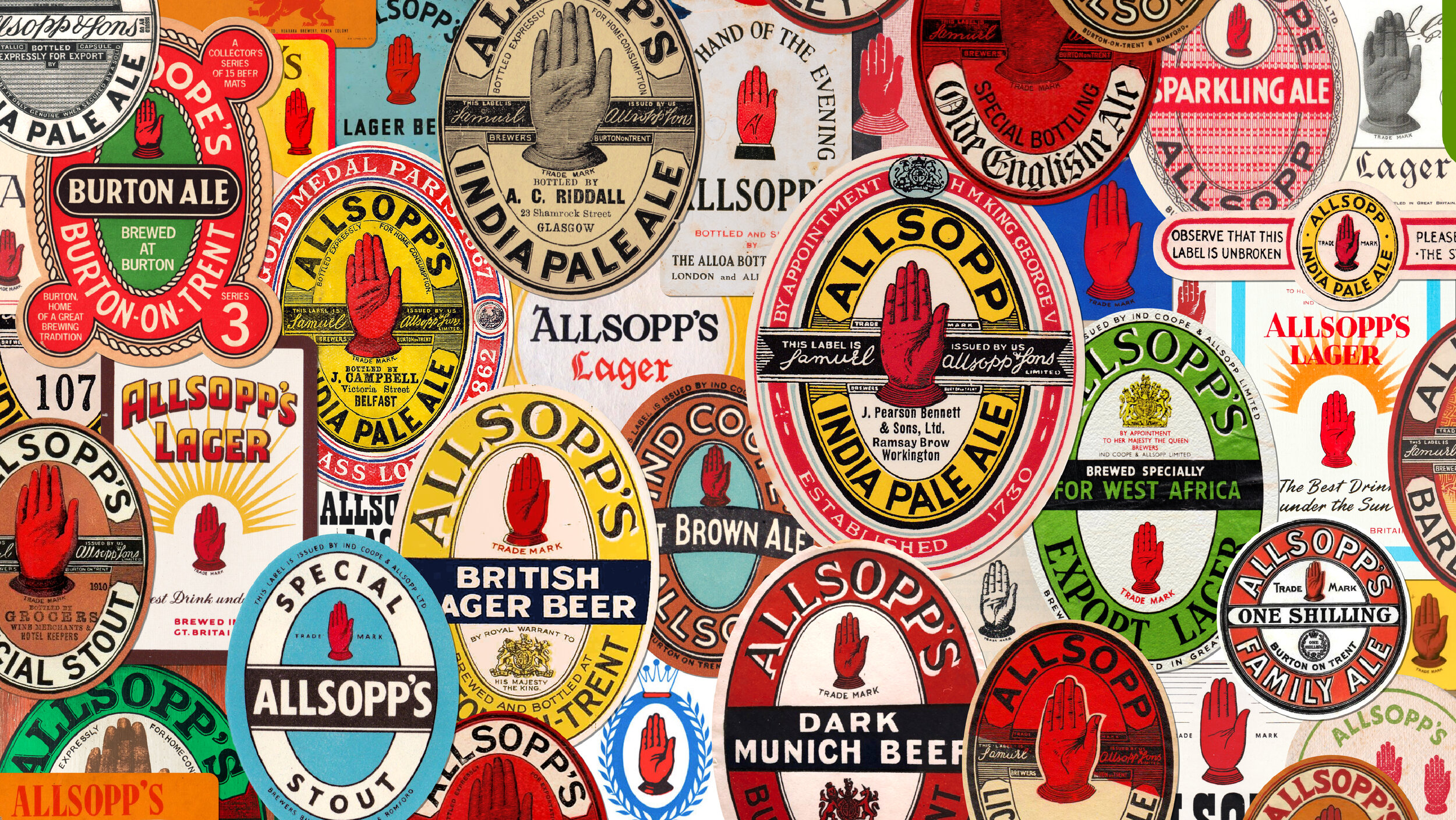
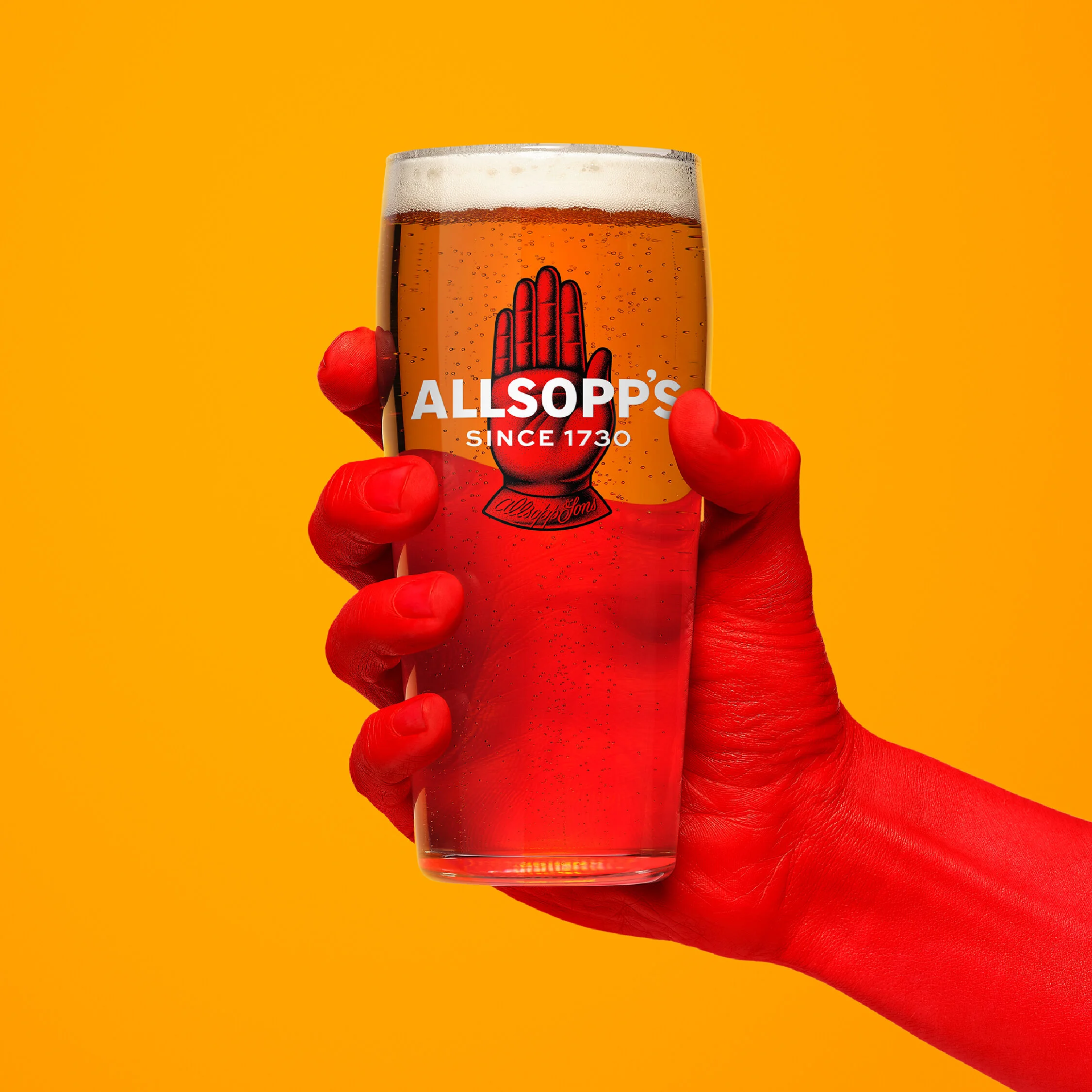
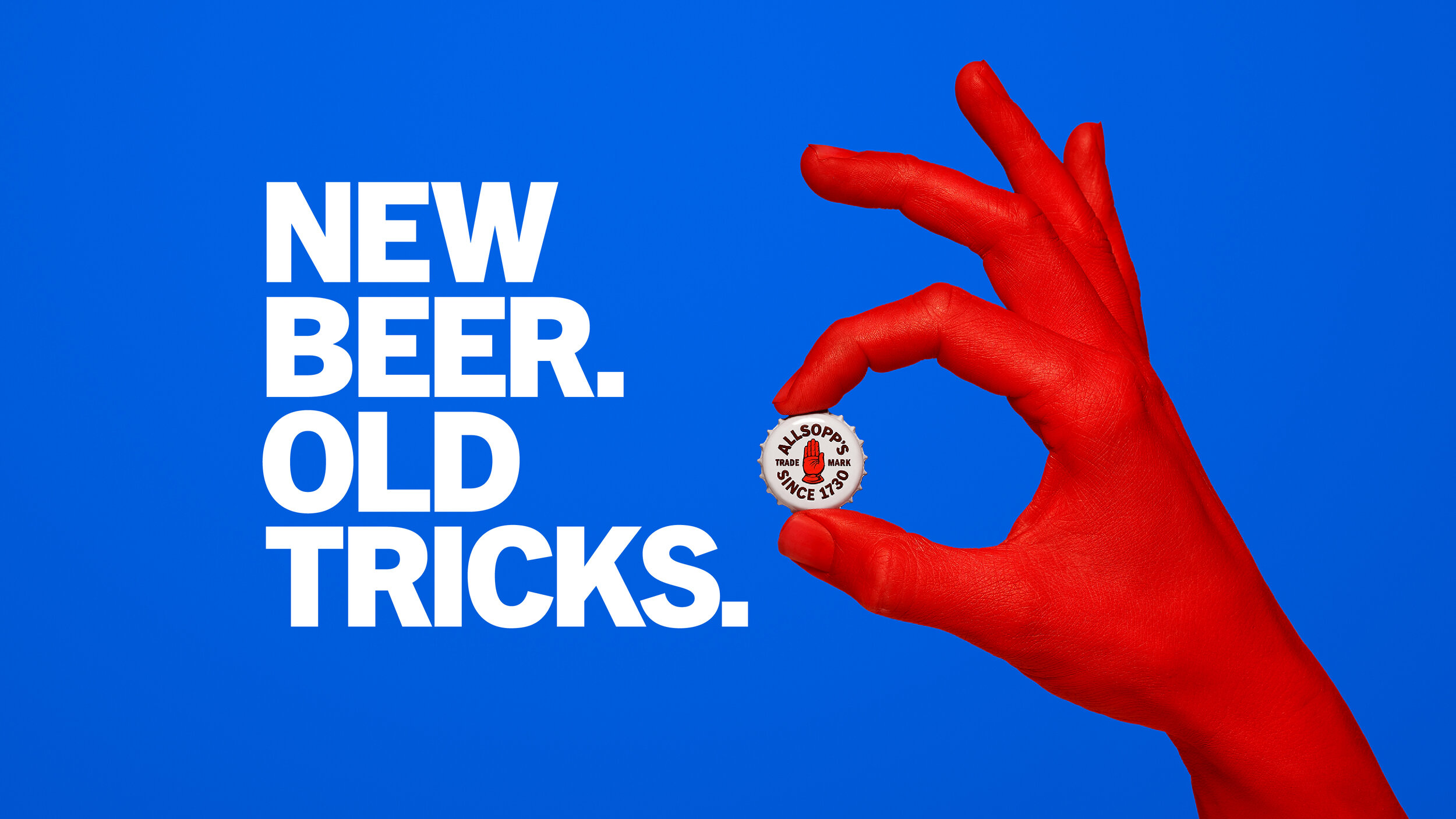
The idiosyncratic red hand, found at the heart of Allsopp’s, was a common sign on British inns during the seventeenth and eighteenth centuries. There is an old story that innkeepers displayed an open hand to indicate that their ale was in good condition and ready for sale, and this is the origin of the Allsopp’s logo, trademarked in 1876, but used by the brewery long before this.
I collaborated with Lloyd Stratton to create a beautiful contemporary illustration of the vintage mark.


Every single aspect of the new look for Allsopp’s has been carefully considered to rebuild a brand that is as genuine, charismatic and fresh today as it was during its illustrious past. Achieving this fine balance required meticulous sifting through Allsopp’s vast archives to find: the right typography to redraw; colours to refine; and imagery to repurpose.


Rebranding Allsopp’s wasn’t just about remixing the past for a contemporary audience. It was about sharing a truly remarkable story with as much tangible richness as possible: all outlandish memorabilia, historical photographs and eccentric packaging from the past welcome!
Credits
Alec Tear — Brand & packaging design
Silas Amos — Brand strategy
Shiran Genis — Project management
Lisa Stillman — Production management
Christopher Sharp — Copywriting
David Brook — Photography
John Zampetti — Retouching