↓
Bloom & Blossom
Context
When sisters-in-law Julia and Christina noticed the major lack of natural, stylish skincare products for them and their kids, they decided to roll their sleeves up and create their own. Since then Bloom & Blossom has been a hugely popular brand. And with the range growing faster than ever, Jones Knowles Ritchie was tasked to reimagine the visual identity – with the goal of becoming a global lifestyle brand.
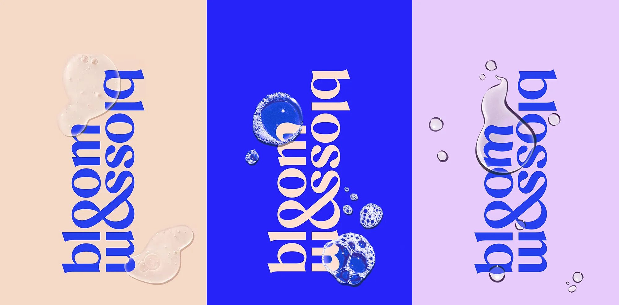
I was brought in to design a new logotype that captured the duality that sits at the heart of the brand – ‘Bloom’ representing parents and ‘Blossom’ their children.
Client
Bloom & Blossom
Agency
Jones Knowles Ritchie

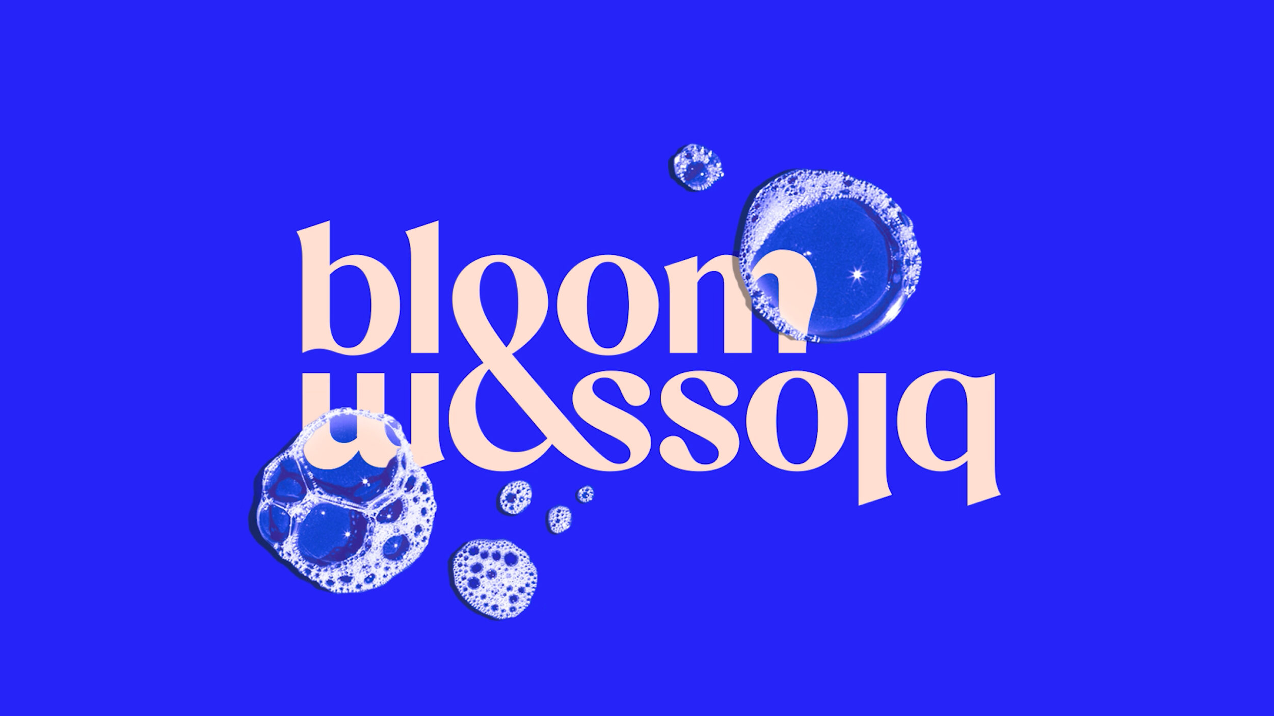
The distinctive ligature ampersand creates a seamless relationship between Bloom and Blossom, representing the strong bond between parent and child. The fluid base of the b's and the droplet shaped terminals on the ‘s’ reference the liquidity of the products.


Credits
Alec Tear — Designer & Lettering Artist
Jones Knowles Ritchie — Packaging Design
Accolades
Dieline Award / First Place
Packaging / Body Care